BigTime Screen, Basic Navigation
The very first screen you see when you login to BigTime is called a "landing page," and your landing page will be based on the system permissions you have. You'll access different pages in the system by using the menu bar (at the top of the screen), and we'll cover that menu bar in the section that follows. Before we do, let's take a quick look at how BigTime's screens are typically organized.
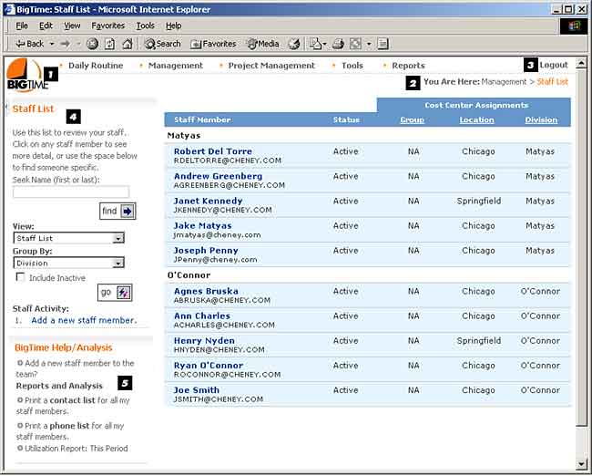
The data screens in BigTime is organized in the same way, and the example screen shown below contains a number of standard elements. The sample format you see is based on the standard BigTime 3.0 theme. That theme places the main menu across the top of the BigTime screen, information boxes and how-do-I links to the right, and the pages main body in the middle of the screen.
While your company may use a theme with a slightly different layout, each of the common elements described below can be found on every theme we publish. Check with your BigTime Administrator if you're not sure where to find any of these key elements.

- Main Menu Screen. The BigTime Main Menu is the primary navigational component. You can switch from screen to screen by selecting the correct menu item, and the menu items you see are based on your personal security rights.
- You Are Here. This link lets you keep track of which screen you are on (and how to navigate there using your BigTime menu). It's updated automatically as you move from screen to screen.
- Logout. You can click this link to logout of BigTime. The system will pop up the main login page, and you can exit your browser. You'll use that logout button to erase the client and server files which keep your connection alive during your BigTime session. Also note that BigTime will log you out automatically after a pre-defined period of inactivity (typically 2 hours).
- Information Boxes. You'll become familiar with some of the common screens quickly, but screens you use less often may be harder to remember and more difficult to navigate. That's where the Information Box can help. This box contains a quick description (or a step-by-step guide) for the screen you're viewing. There may also be view/grouping settings in the information box, seek/find controls, or a set of sub-screen options.
If you're already familiar with a screen, you can turn off its information box by clicking the close icon next to the Title. Note that this will also hide any navigational controls which that information box might include.
- How-Do-I Links. Each screen may have one or more How-Do-I links. Those links are direct connections to the BigTime help system, and they provide instant context-sensitive help for common tasks associated with the screen you're currently viewing. Point users to the How-Do-I box as a general first step if they aren't sure how to perform specific tasks.
Your How-Do-I boxes may also contain links to reports that are based on the data you see on screen. These reports are often a much better option than printing the screen, and they typically pull sorting/grouping options automatically (based on the way you've configured your screen).
